Showing posts with label Ozone. Show all posts

Thursday, December 1, 2016

Comparing the MYNN and MYJ planetary boundary layer schemes for a Lake Breeze event.

I was the lead author for a paper titles "Impact of Lake Breezes on Summer Ozone Concentration in the Salt Lake Valley." This article was recently accepted in the Journal of Applied Meteorology and Climatology. (see article here: http://journals.ametsoc.org/doi/abs/10.1175/JAMC-D-16-0216.1)

One concern from the reviewers was our use of the MYJ planetary boundary layer scheme. They pointed to evidence that the MYNN scheme was superior, and may improve our results, particularly in the timing of a lake breeze passage on June 18, 2016. We declined to re-run the simulation using the MYNN due to computing resources and time.

I have since re-ran the simulation with the MYNN and found the results are very similar with the MYJ. Below are time series graphs for the stations presented in the paper with the temperature and wind with the MYNN model run overlaid in magenta. The only change between the "WRF" and "MYNN" model data is that the MYNN uses the MYNN PBL scheme instead of the MYJ PBL scheme.
Color and station name denote the observed temperature and wind at the station location. Black dashed is the original WRF simulation, magenta dashed is the same simulation except uses MYNN boundary layer physics.

Temperature and wind patterns between the two runs are very similar. We see that using the MYNN did not change the timing of the lake breeze on this day.

The cause of the observed delay in the lake breeze progression is likely caused by stronger meridional wind component below 5,000 meters (550 mb). In the vertical profiles below, you can see the opposing southerly winds at the Salt Lake City Airport were from the direct south at 10 m/s below an inversion layer at 5,000 m. The HRRR and WRF with MYNN PBL scheme had slightly weaker winds and more from the southwest. This subtle difference is likely the primary reason for the delayed lake breeze on the afternoon of 18 June 2016. The next question is, "how do we fix that subtlety in the model." I'm not sure I know the answer to that.
Vertical profile of potential temperature, mixing ratio, and vector winds at 19 June 2015 00z. Profiles for Salt Lake City Rawinsonde (blue), HRRR analysis (red), HRRR 1-hr forecast (green), and WRF with MYNN PBL Scheme (black) are shown. Notice in the observed sounding the critical level at 5,000 m where there was a temperature inversion. Below this level winds opposed the lake breeze and were directly south while the simulated winds were weaker and more southwesterly than the observed winds. This subtlety is the likely reason why the WRF simulation missed the delayed lake breeze.


Just as a comparison between 3 km and 1 km domains: the lake breeze is much less "sharp" in the outermost domain, run at 3 km (right), than the inner domain run at 1 km (right).
Domain 2 with 1 km grid spacing
Domain 1 with 3 km grid spacing


Friday, October 2, 2015

EPA Reduces Ozone Standard to Improve Health

Press Release from the Environmental Protection Agencty (EPA) regarding the change in the ozone standard...

EPA Strengthens Ozone Standards to Protect Public Health/Science-based standards to reduce sick days, asthma attacks, emergency room visits, greatly outweigh costs

Release Date: 10/1/2015
Contact Information: Enesta Jones, Jones.enesta@epa.gov,, 202-564-7873, 202-564-4355; En espaƱol: Lina Younes, younes.lina@epa.gov, 202-564-9924, 202-564-4355

WASHINGTON – Based on extensive scientific evidence on effects that ground-level ozone pollution, or smog, has on public health and welfare, the U.S. Environmental Protection Agency (EPA) has strengthened the National Ambient Air Quality Standards (NAAQS) for ground-level ozone to 70 parts per billion (ppb) from 75 ppb to protect public health. The updated standards will reduce Americans’ exposure to ozone, improving public health protection, particularly for at risk groups including children, older adults, and people of all ages who have lung diseases such as asthma. Ground-level ozone forms when nitrogen oxides (NOx) and volatile organic compounds (VOCs) react in the air. 

“Put simply – ozone pollution means it hurts to breathe for those most vulnerable: our kids, our elderly and those suffering from heart and lung ailments,” said EPA Administrator Gina McCarthy. “Our job is to set science-backed standards that protect the health of the American people. Today’s action is one of the most important measures we can take for improving public health, reducing the costs of illness and protecting our children’s health.”
EPA examined nearly 2,300 studies in this review of the ozone standards including more than 1,000 new studies published since the last review of the standards in 2008. Scientific evidence shows that ozone can cause a number of harmful effects on the respiratory system, including difficulty breathing and inflammation of the airways. The revised standards will significantly improve public health protection, resulting in fewer premature deaths, and thousands fewer missed school and work days and asthma attacks. For people with lung diseases like COPD (chronic obstructive pulmonary disease) or the 23 million Americans and 6 million children living with asthma, these effects can aggravate their diseases, leading to increased medication use, emergency room visits and hospital admissions. Evidence also indicates that long-term exposure to ozone is likely to be one of many causes of asthma development. And studies show that ozone exposure is likely to cause premature death. The public health benefits of the updated standards, estimated at $2.9 to $5.9 billion annually in 2025, outweigh the estimated annual costs of $1.4 billion.
Local communities, states, and the federal government have made substantial progress in reducing ground-level ozone. Nationally, from 1980 to 2014, average ozone levels have fallen 33 percent, while the economy has continued to grow. And by 2025, EPA projects that existing rules and programs will bring the vast majority of the remaining counties into compliance. Advances in pollution control technology for vehicles and industry along with other emission reduction standards, including “Tier 3” clean vehicle and fuels standards, the Clean Power Plan and the Mercury and Air Toxics Standards, will significantly cut smog-forming emissions, helping states meet today’s updated ozone standards.
To ensure that people are alerted when ozone reaches unhealthy levels, EPA is extending the ozone monitoring season for 32 states and the District of Columbia. This is particularly important for at-risk groups, including children and people with asthma because it will provide information so families can take steps to protect their health on smoggy days.
EPA also is strengthening the “secondary ozone standard” to 70 ppb, which will improve protection for trees, plants and ecosystems. New studies since the last review of the standards add to evidence showing that repeated exposure to ozone reduces growth and has other harmful effects on plants and trees. These types of effects have the potential to harm ecosystems and the benefits they provide.
The Clean Air Act provides states with time to meet the standards. Depending on the severity of their ozone problem, areas would have until between 2020 and 2037 to meet the standards.
The Clean Air Act requires EPA to review the ozone standards every five years to determine whether they should be revised in light of the latest science. Today’s action comes after a thorough review and public comment process. The agency received more than 430,000 written comments on the proposed standards and held three public hearings.

Wednesday, September 9, 2015

Deer Creek Fire: Smoke and Ozone

A fire up Provo Canyon near Deer Creek Reservoir has burned over 600 acres and, as of this morning, is only 5% contained. Fires up canyons are dangerous to firefighters because canyon winds can change direction and spread the fire rapidly. Read the KSL story here.

Yesterday I drove up the canyon to measure ozone concentrations. Ozone at the bottom of the canyon was low, in the 40s ppb. Near the fire the ozone concentration was elevated with a max concentration of 64 ppb. Wildfires is one source of ground level ozone (review article here).


Smoke plume seen from MODIS Terra satellite
Smoke plume seen from MODIS Aqua satellite later that day.

Monday, August 3, 2015

June through July Ozone Clock

Below are a few "Ozone Clocks" for June and July 2015 from measurement stations around northern Utah. These should convince you that the best time to exercise outside out be in the morning when ozone pollution is always low. The afternoon and evening hours ozone concentrations are frequently higher. You can create your own ozone roses and clocks on my website here: http://home.chpc.utah.edu/~u0553130/BB_home/cgi-bin/ozone_rose.cgi


Wednesday, July 15, 2015

Summary of June Ozone in Northern Utah

As part of the Great Salt Lake Summer Ozone Study, we have put together a summary of June Ozone statistics. This bar chart shows the number of stations that observed an 8-hour average over 75 ppb (in blue) and 65 ppb (in orange). The current EPA attainment standard is 75 ppb, but is expected to be lowered. 
 June ozone was highest during the hot weeks when a persistent ridge was camped out over Utah, giving us mostly clear skies and hotter than normal June summer days. Ozone pollution tended to clear out after rain events. As you can see, there several periods when ozone pollution was over the EPA's health standard. When the health standard is lowered, more days will be classified as unhealthy air. This will be a challenge for Utah and many places in the United States dealing with high ozone as they come up with strategies to improve air quality.

Thursday, July 2, 2015

Spanish Fork June 2015 Ozone

Below is a special kind of pollution rose I like to call an "Ozone Clock." This plot was from created with data at the Spanish Fork air quality site at the Airport. Imagine looking at a 24 hour clock with midnight at the top of the clock and noon at the bottom of the clock. AM hours are on the right half of the clock and PM hours are on the left half.

This plot shows the frequency of ozone concentration in Spanish Fork during the month of June, 2015. Ozone is most frequently at at healthy levels in the early morning hours between 6:00 and 9:00 AM. This is the best time of day to do some outdoor exercise. The worst ozone pollution most frequently in the afternoon hours between 15:00 and 20:00 (3:00 - 8:00 PM)


Wednesday, July 1, 2015

Great Salt Lake Summer Ozone Study: Ozone and Wind Roses

NEW Ozone/Wind Rose Interface! Click Here

A wind rose is a type of diagram that shows the distribution of wind direction at a location. Lines point from the direction the wind blows. Longer lines indicate that winds blow more frequently from that direction (given in a percentage of observations). Colors indicate the distribution of wind speed for that direction. For example, winds at Hawthorne in June 2015 were generally from the northwest or between south and east. Winds from the northeast or southwest were rare. Wind speed is almost always less than 4 m/s from any direction.
  wspd_legend Instead of plotting wind speed as a function of wind direction, we can plot ozone concentration as a function of wind direction. These are sometimes called a "pollution rose." The pollution rose below shows the same June 2015 period at Hawthorne. During the month of June, Hawthorne most frequently experienced unhealthy ozone concentrations when with winds were from the northwest. Air quality was generally good when winds blew from between south and east.
  plot_ozone_rose_ozone_qhw ozone_legend

 Figures like this can be created using the interface here: http://meso2.chpc.utah.edu/gslso3s/cgi-bin/ozone_rose.cgi   

Options include:
  • Station ID: Select one in-situ station from the list of IDs
  • Rose Type: Select rose type. Ozone and Wind Speed have been discussed. (The clock roses will be discussed later.)
  • Time Option: UTC or Local time
  • Hour Interval: Default is "All Day" which shows all ozone observations between the dates. You can change the hour interval to look at 3 hour chunks of the day. This is useful to see ozone concentrations for different times of the day. For example, at Hawthorne pollution roses between 6:00-9:00 AM looks very different than at 3:00-6:00 PM
  • qhw_6-9qhw_12-18
  • Pot Range: This allows you to zoom in and out of the polar plot. The number selected will be the outermost percentage displayed.
  • Begin Time: The beginning month, day, year, and hour.
  • End Time: The ending month, day, year, and hour.
NOTE: The pollution rose currently bins the ozone concentration with the wind direction observed at the time the ozone measurement is recorded. This means that ozone monitors that record 1-hour ozone may have a wind direction that is different than the 1-hour average wind direction (does that make sense??)
---- Some examples ----
This tool allows you to look at ozone concentrations and wind for different days at any station. Pollution roses for Hawthorne on each day of IOP 1 were quite different. On Wednesday, the air was clean when air blew from the south, and was dirty when it blew from the north-northwest. Thursday, however, had much more frequent winds from the south and south east with cleaner air.
  qhw_IOP1_17 qhw_IOP1_18  
---- Another View Point ----
Rather than plotting ozone concentration or wind speed frequency as a function of wind direction, another way to look at ozone concentration is as a function of time of day. I call this an "ozone clock." Imagine looking at a 24-hour clock with midnight at the top and noon at the bottom. Below shows the MTMET "ozone clock" for the month of June. As expected, ozone concentrations are most healthy (green) in the morning hours. The afternoon, especially 15:00, most frequently has the most polluted air because ozone is produced in the presence of sunlight.
  plot_ozone_rose
 NOTE: When creating plots like this for other stations, it is best to look at long periods of time (weeks to months), otherwise it may look as if a big bite has been taken out of the clock. The bit is caused when some hours have no wind direction reported. Ideally, the "clock" should roughly look like a circle because there are the same amount of each hour in a day (i.e. 3:00 AM occurs seven times in a week, as does 8:00 PM. In other words, each hour should occur 4.2% of the time). A wavy circle is caused when there are different amounts of observations for each hour during the period.   

Send suggestions or comments about the interface to brian.blaylock@utah.edu

Wednesday, June 24, 2015

Monday, June 22, 2015

In the News: Great Salt Lake Summer Ozone Study

The Deseret News recently published an article about the Great Salt Lake Ozone study. You can read the Deseret News story here. It's dark, but you can kind of see my hat...
The Nerdmobile. Photo by Jeff Allred

Tuesday, June 16, 2015

June 15 Evening Thunderstom

Last night's thunderstorm in Salt Lake City may have caused and increase in ozone at several air quality monitoring stations. Thunderstorms can cause increased ozone because lightning creates NOx, a compound that is a precurosr pollutant that can create ozone. Also strong downdrafts from thunderstorms can transport stratospheric ozone down to the surface.
Circled in Red is the ozone increase during the time of the thunderstorm.
lighting_ozone
Radar at 23:05 Local time
radar_SLC_20150615-23-05-local
Lots of CAPE that evening from the HRRR sounding (21:00 local time)
HRRRSKEWT_KSLC2015061602F000
Screen shots from a video of lighting captured by Ansley Long
lightning_ansley_longlightning_ansley_long2


And more from Twitter
lightning_twitter

Wednesday, June 3, 2015

Ozone Chasers

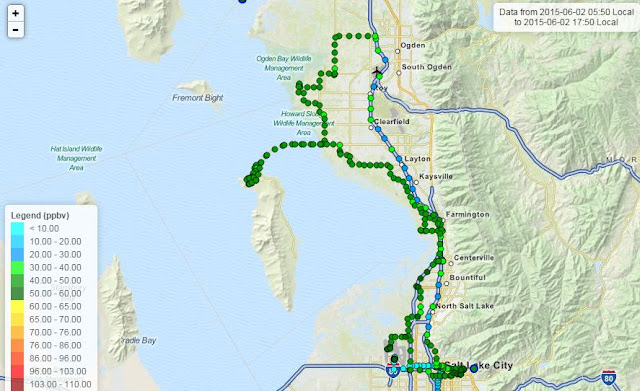
There weren't any storms to chase yesterday. Instead, we chased ozone pollution!

This summer our research group is involved in the Great Salt Lake Summer Ozone Study. The truck is equipped with and ozone monitor and a GPS.
Ozone Monitor
Truck with inlet tube sticking out the window and GPS on top of the truck.
Yesterday we we drove the truck from Ogden to Antelope Island and then to the international airport with an ozone monitor. We never encountered unhealthy levels of ozone, which is good. But ozone pollution in Salt Lake doesn't usually get to unhealthy levels until July because of it's dependence on sunlight. Later this summer we will be taking more observations. Yesterday's ozone chase was to test a route for the University of Utah Nerdmobile.

Of course, I couldn't leave Antelope Island without a bison selfie...

One of the projects I've worked on is providing HRRR sounding plots available for every hour of every day during the summer. I created this page for viewing these plots. These plots are from the HRRR analysis bufr soundings (downloaded from Penn State) and are created with this skew-T python package.

Friday, July 5, 2013

Los Angeles Air Quality

As part of NASA's Student Airborne Research Program I am looking at meteorological influences on high and low ozone days. I've downloaded data from the EPA's website and put together the following plot using Python. It shows the number of days in each Air Quality Index (AQI) category for the last twenty years.
(c) bkb

The colors represent the number of days LA exceeded the EPA's health standard: 75 ppbv. Over the last twenty years there are fewer days with unhealthy levels. The number of days with 'very unhealthy' air is practically zero.


Here is a plot showing the AQI for each day in 2012:
bkb (c)
Notice that the winter months only have good ozone AQI days. This seasonal trend is noticeable during all years. Ozone forms photochemically in the air when other pollutants react in the presence of sunlight. This explains the low ozone concentrations during the winter months. There is not sufficient energy from the sun to make the ozone form. The daily solar energy is lower during winter months for two reasons. First, days are shorter. And second, the earth's rotation is tilted away form the sun causing sunlight to spread over a larger area.

In comparison here is a plot of ozone AQI values for Salt Lake City in 2012: 
bkb (c)
Again, we see low ozone concentrations in the winter months. (Notice that there is missing data in October and December.) Salt Lake does not have many days that exceed the EPA's National Ambient Air Quality Standard (NAAQS). There are two other factors that can causes the difference in these two cities: emission amounts or type, and weather.

Salt Lake, however, has other pollution problems they deal with. Particulate Matter smaller than 2.5 microns, otherwise known as PM 2.5, is the troublesome pollutant along the Wasatch Front. Unlike ozone, PM 2.5 doesn't seem to follow an annual trend. Not shown in this chart is a long polluted episode throughout January 2013. A strong inversion kept air near the surface. The mountains act as barriers that prevented the pollution to mix away. Meteorology, topography, and emissions play a large role in PM 2.5 concentrations in Northern Utah. The year 2012 was fairly unpolluted, but the beginning of 2013 had several days with very unhealthy air quality. Those episodes occur during periods of strong inversions.
bkb (c)